Copy. Paste. Create premium eCovers in seconds.
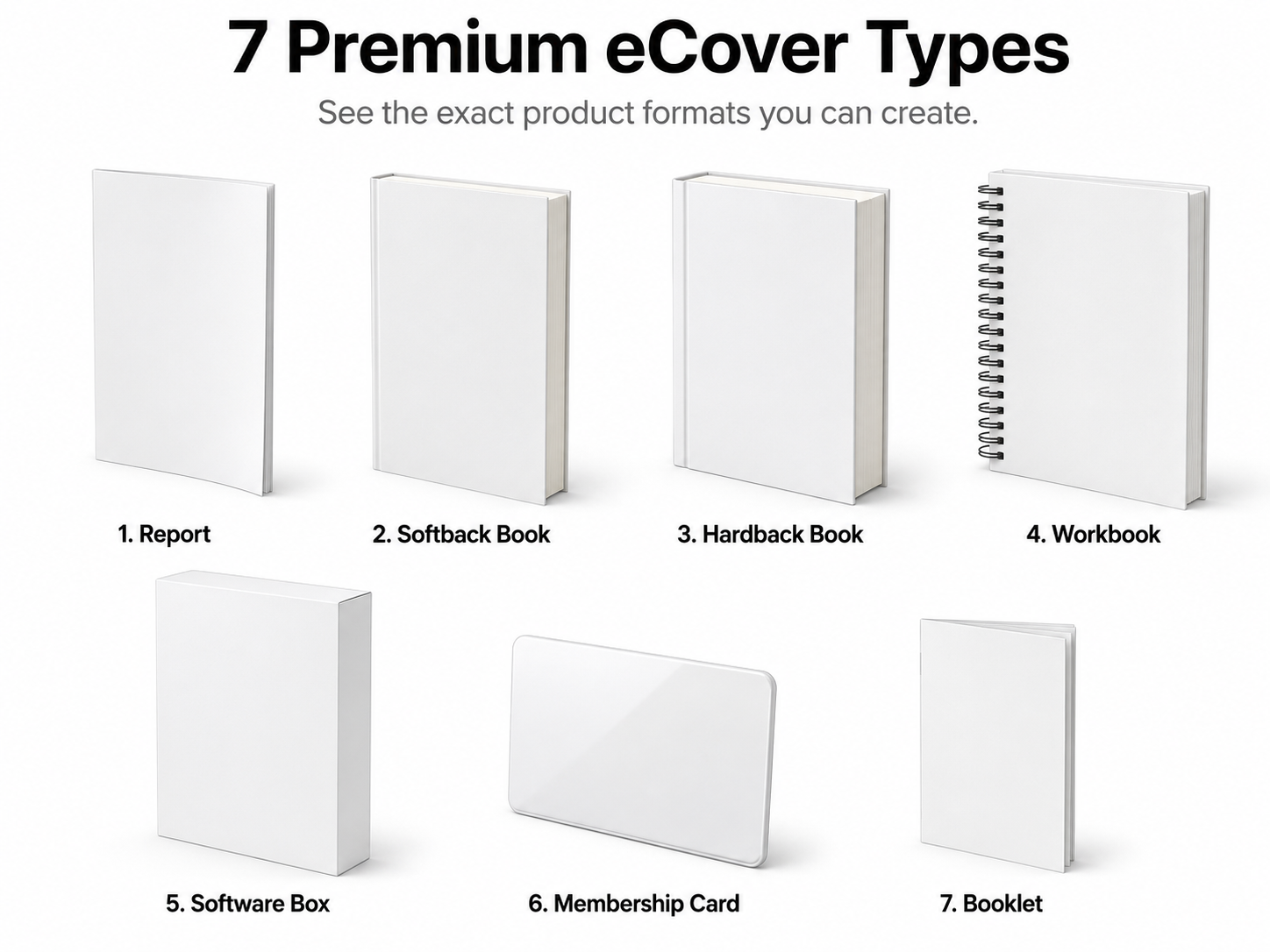
Zero design skill required. In 3-steps use ChatGPT to generate unlimited, polished eCovers for software, reports, workbooks, ebooks, membership site, and more. Create eCovers in seconds for all of your digital products.
Effortless eCovers FAST EXPRESS Mode
Use this section when you want the quickest path to a finished ecover prompt workflow.
FAST EXPRESS Mode Details
Use the quick workflow below when you want the fastest path to finished ecover.
FAST EXPRESS Mode Prompts
Use these in order inside a fresh ChatGPT chat for the fastest ecover workflow.
We are going to create a premium ecover mockup using Effortless eCovers FAST Mode in this chat session.

Here is the cover text we will use later:
Product Title: [Enter Your Offer Name]
Subtitle: No subtitle was provided by the user. Create one short, clear, benefit-driven subtitle from the offer information and place that generated subtitle on the cover. Do not print this instruction as the subtitle.
Include the author/brand name: [Enter Your Author or Brand Name]

In my next message, I will paste in my offer information.

Your job in this chat session:
1. First, acknowledge this setup.
2. Then wait for my offer information.
3. When I provide that offer information, read it and use it only as context for the ecover design.
4. After receiving the offer information, do not create the image yet. Ask me for the FAST Mode ecover creation prompt.
5. When I paste the FAST Mode ecover creation prompt, then create the finished ecover image.

Use the pasted offer information to understand the offer's niche, audience, promise, emotional hook, transformation, tone, category expectations, buyer desire, visual mood, and best cover positioning.

Do not create the image yet. Do not write the ecover prompt yet. Do not summarize unless absolutely necessary.

For now, simply acknowledge this by saying exactly:

I understand, paste in your offer information.

After I provide the offer information, reply exactly:

Got it. Paste the FAST Mode ecover creation prompt.
Step 2 Paste in your offer information.
Create a consistent premium software box mockup. The product must appear as a tall upright rectangular software box at a three-quarter studio angle. Use a dominant front panel, visible side panel, thick product depth, sharp rectangular edges, clean studio lighting, realistic soft shadow, and polished digital-product packaging. Keep the same geometry every time: upright software box, visible side panel, thick rectangular depth, sharp edges, and front-facing product display. Do not make it look like a book, report, binder, tablet, app screen, laptop, flat poster, physical shipping box, or cube.

Create one finished ecover mockup using this exact cover text:
Product Title: [Enter Your Offer Name]
Subtitle: No subtitle was provided by the user. Create one short, clear, benefit-driven subtitle from the offer information and place that generated subtitle on the cover. Do not print this instruction as the subtitle.
Include the author/brand name: [Enter Your Author or Brand Name]

Use the offer information I provided earlier in this same chat as product context.

Use that context to understand the offer's niche, audience, promise, emotional hook, transformation, tone, category expectations, buyer desire, visual mood, and best cover positioning.

The entire look of the cover must be custom-fit to the offer information, not generic. The actual imagery, tone, typography feel, visual symbolism, hierarchy, accent details, and overall theme must match the offer context.

Do not invent product features, modules, bonuses, claims, statistics, testimonials, logos, certification seals, brand names, or extra cover text that was not provided.

Design style to use:
Analyze the offer information provided earlier in this chat and choose the strongest professional design direction for this exact offer. Base the design choice on the offer's audience, promise, tone, price impression, niche expectations, and emotional hook. Do not use a random style. Choose a cover direction that makes the product feel clear, desirable, credible, polished, and ready to sell.

Product-match rule:
Do not create a generic cover. Make the cover feel specifically designed for this exact offer based on the offer information provided earlier in the chat. The visual theme, imagery, accent details, mood, typography personality, and layout should all feel naturally connected to the offer's market, promise, buyer, and emotional hook. Avoid generic stock-looking art, random decorative graphics, unrelated symbols, vague tech visuals, one-size-fits-all design choices, or designs that look like the title was simply swapped into a template.

Color direction for the cover design:
Choose the strongest color direction based on the product context. The cover colors must support the offer's promise, buyer desire, niche expectations, emotional hook, and perceived value. The final image background outside the product must remain pure white unless transparent background was selected.

Mockup direction rule:
Use the selected mockup direction: Left Facing. Left Facing means the front cover or front panel faces slightly toward the viewer's right, with the left-side spine, page edge, side panel, or card edge visible. This direction rule changes only the viewing angle. Do not change the product type, shape, thickness, proportions, cover format, lighting, or background.

Cover strength rule:
The cover design must look like a finished premium product that could stop a buyer mid-scroll. Push the design harder with bold title hierarchy, dramatic contrast, rich depth, sharper visual energy, stronger focal point, and a clear custom concept tied to the offer. Make it feel striking, expensive, modern, and commercially powerful while staying clean, readable, and professional.

Bold dramatic design rule:
Do not settle for safe, flat, plain, timid, lightly decorated, or template-style design. Use large confident typography, high-impact spacing, strong contrast, dynamic composition, premium accents, and product-specific imagery that makes the cover feel instantly valuable. The result should feel bold, vibrant, creative, and visually memorable without becoming cluttered, cheesy, childish, or hard to read.

Visible side title rule:
If the selected product format has a visible spine, fold, edge, or side panel, place the product title clearly and cleanly on that visible side. Do not leave the visible side blank. For softback books, hardback books, reports, booklets, and software boxes, the title should appear on the visible side or spine when logically visible. For spiral workbooks, do not place the product title on the spine, coil binding, side edge, or page-edge area. Keep all product title text on the front cover only. For membership cards, do not force a fake spine or fake side title.

Shape consistency rule:
The selected ecover type controls the physical shape. Do not reinterpret, redesign, expand, combine, or replace that shape. Do not add companion products, duplicate covers, bonus stacks, extra books, extra cards, devices, packaging, props, hands, people, scenes, shelves, rooms, desks, floating icons, or background objects. Only create one clean mockup in the exact selected product format.

Text accuracy rule:
Use only the exact product title, subtitle instructions, and author or brand name provided above.

If the subtitle field was filled in, use that exact subtitle.

If no subtitle was provided, create a short benefit-driven subtitle from the offer information, copy, description, or uploaded PDF context and place the actual generated subtitle on the cover. Do not place the subtitle instruction text on the cover.

If a word does not fit cleanly, simplify the layout instead of inventing extra words.

Do not add fake taglines, labels, badges, seals, feature names, menu items, chapters, testimonials, or random text. Avoid gibberish, misspellings, distorted letters, unreadable microtext, or random filler copy.

White background rule:
Place the finished ecover mockup on a clean pure white studio background. Use realistic soft shadows under and behind the product, but do not add scenery, rooms, desks, gradients, props, patterns, textures, dark backgrounds, colored backgrounds, or environmental objects. The background outside the product must stay pure white so the mockup looks clean, reusable, and ready for sales pages, product thumbnails, ads, and marketplace listings.

Professional design rule:
Make the final ecover look like a premium digital product brand asset, not a basic AI image. The cover must be polished, bold, dramatic, clear, product-specific, and sales-page ready. It should feel custom to the offer, strongly connected to the topic, promise, audience, and emotional hook, and powerful enough to make someone pause, click, and take the product seriously. Avoid cluttered, childish, generic, cheap-looking, unrelated, timid, flat, boring, or amateur visual choices.

Final hard check before generating:
Confirm silently that the image contains exactly one selected ecover mockup, the correct locked shape, the exact provided cover text, a premium, bold, dramatic, product-matched visual theme, the product title on any logical visible spine or side panel except spiral workbooks, where the title stays on the front cover only, the exact provided subtitle if one was entered or a generated subtitle that matches the offer context if no subtitle was entered, no invented claims, no extra objects, and a pure white background.
Advanced eCover Builder
Use this section when you want more control over design style and other options.
Cover Details
Fill this out once, then generate your copy-ready prompts.
Copy Ready Prompts
Use these in order inside a fresh ChatGPT chat.
We are going to create a premium ecover mockup in this chat session.

Here is the cover text we will use later:
Product Title: [Enter Your Offer Title]
Subtitle: No subtitle was provided by the user. Create one short, clear, benefit-driven subtitle from the product context and place that generated subtitle on the cover. Do not print this instruction as the subtitle.
Include the author/brand name: [Enter Your Author or Brand Name]

In my next message, I will paste my sales copy, product description, offer details, or upload the PDF if this is a PDF product.

Your job in this chat session:
1. First, acknowledge this setup.
2. Then wait for my product copy, product description, offer details, or PDF.
3. When I provide that product context, read it and use it only as context for the ecover design.
4. After receiving the product context, do not create the image yet. Ask me for the ecover creation prompt.
5. When I paste the ecover creation prompt, then create the finished ecover image.

Use the product context to understand the product's niche, audience, promise, emotional hook, transformation, tone, category expectations, buyer desire, visual mood, and best cover positioning.

Do not create the image yet. Do not write the ecover prompt yet. Do not summarize unless absolutely necessary.

For now, simply acknowledge this by saying exactly:

I understand, paste in your sales copy, description, or upload the PDF if it's a PDF product.

After I provide the product context, reply exactly:

Got it. Paste the ecover creation prompt.
Step 2 Paste sales copy, a product description, offer details, or upload a PDF.
Create a consistent premium software box mockup. The product must appear as a tall upright rectangular software box at a three-quarter studio angle. Use a dominant front panel, visible side panel, thick product depth, sharp rectangular edges, clean studio lighting, realistic soft shadow, and polished digital-product packaging. Keep the same geometry every time: upright software box, visible side panel, thick rectangular depth, sharp edges, and front-facing product display. Do not make it look like a book, report, binder, tablet, app screen, laptop, flat poster, physical shipping box, or cube.

Create one finished ecover mockup using this exact cover text:
Product Title: [Enter Your Offer Title]
Subtitle: No subtitle was provided by the user. Create one short, clear, benefit-driven subtitle from the product context and place that generated subtitle on the cover. Do not print this instruction as the subtitle.
Include the author/brand name: [Enter Your Author or Brand Name]

Use the sales copy, product description, offer details, or uploaded PDF I provided earlier in this same chat as product context.

Use that context to understand the product's niche, audience, promise, emotional hook, transformation, tone, category expectations, buyer desire, visual mood, and best cover positioning.

The entire look of the cover must be custom-fit to the product context, not generic. The selected design style is only a visual lens. The actual imagery, tone, typography feel, visual symbolism, hierarchy, accent details, and overall theme must match the sales copy, product description, offer details, or PDF context.

Do not invent product features, modules, bonuses, claims, statistics, testimonials, logos, certification seals, brand names, or extra cover text that was not provided.

Design style to use:
Analyze the product context provided earlier in this chat and choose the strongest professional design direction for this exact offer. Base the design choice on the product's audience, promise, tone, price impression, niche expectations, and emotional hook. Do not use a random style. Do not force a niche-specific theme. Choose a cover direction that makes the product feel clear, desirable, credible, polished, and ready to sell.

Product-match rule:
Do not create a generic cover. Make the cover feel specifically designed for this exact product, based on the product context provided earlier in the chat. The visual theme, imagery, accent details, mood, typography personality, and layout should all feel naturally connected to the product's market, promise, buyer, and emotional hook. Avoid generic stock-looking art, random decorative graphics, unrelated symbols, vague tech visuals, one-size-fits-all design choices, or designs that look like the title was simply swapped into a template.

Color direction for the cover design:
Choose the strongest color direction based on the product context. The cover colors must support the offer's promise, buyer desire, niche expectations, emotional hook, and perceived value. The final image background outside the product must remain pure white unless transparent background was selected.

Mockup direction rule:
Use the selected mockup direction: Left Facing. Left Facing means the front cover or front panel faces slightly toward the viewer's right, with the left-side spine, page edge, side panel, or card edge visible. This direction rule changes only the viewing angle. Do not change the product type, shape, thickness, proportions, cover format, lighting, or background.

Cover strength rule:
The cover design must look like a finished premium product that could stop a buyer mid-scroll. Push the design harder with bold title hierarchy, dramatic contrast, rich depth, sharper visual energy, stronger focal point, and a clear custom concept tied to the offer. Make it feel striking, expensive, modern, and commercially powerful while staying clean, readable, and professional.

Bold dramatic design rule:
Do not settle for safe, flat, plain, timid, lightly decorated, or template-style design. Use large confident typography, high-impact spacing, strong contrast, dynamic composition, premium accents, and product-specific imagery that makes the cover feel instantly valuable. The result should feel bold, vibrant, creative, and visually memorable without becoming cluttered, cheesy, childish, or hard to read.

Visible side title rule:
If the selected product format has a visible spine, fold, edge, or side panel, place the product title clearly and cleanly on that visible side. Do not leave the visible side blank. For softback books, hardback books, reports, booklets, and software boxes, the title should appear on the visible side or spine when logically visible. For spiral workbooks, do not place the product title on the spine, coil binding, side edge, or page-edge area. Keep all product title text on the front cover only. For membership cards, do not force a fake spine or fake side title.

Shape consistency rule:
The selected ecover type controls the physical shape. Do not reinterpret, redesign, expand, combine, or replace that shape. Do not add companion products, duplicate covers, bonus stacks, extra books, extra cards, devices, packaging, props, hands, people, scenes, shelves, rooms, desks, floating icons, or background objects. Only create one clean mockup in the exact selected product format.

Text accuracy rule:
Use only the exact product title, subtitle instructions, and author or brand name provided above.

If the subtitle field was filled in, use that exact subtitle.

If no subtitle was provided and the subtitle handling instruction says to create one, create a short benefit-driven subtitle from the product context and place the actual generated subtitle on the cover. Do not place the subtitle instruction text on the cover.

If a word does not fit cleanly, simplify the layout instead of inventing extra words.

Do not add fake taglines, labels, badges, seals, feature names, menu items, chapters, testimonials, or random text. Avoid gibberish, misspellings, distorted letters, unreadable microtext, or random filler copy.

White background rule:
Place the finished ecover mockup on a clean pure white studio background. Use realistic soft shadows under and behind the product, but do not add scenery, rooms, desks, gradients, props, patterns, textures, dark backgrounds, colored backgrounds, or environmental objects. The background outside the product must stay pure white so the mockup looks clean, reusable, and ready for sales pages, product thumbnails, ads, and marketplace listings.

Professional design rule:
Make the final ecover look like a premium digital product brand asset, not a basic AI image. The cover must be polished, bold, dramatic, clear, product-specific, and sales-page ready. It should feel custom to the offer, strongly connected to the topic, promise, audience, and emotional hook, and powerful enough to make someone pause, click, and take the product seriously. Avoid cluttered, childish, generic, cheap-looking, unrelated, timid, flat, boring, or amateur visual choices.

Final hard check before generating:
Confirm silently that the image contains exactly one selected ecover mockup, the correct locked shape, the exact provided cover text, a premium, bold, dramatic, product-matched visual theme, the product title on any logical visible spine or side panel except spiral workbooks, where the title stays on the front cover only, no invented claims, no extra objects, and the correct background.
Instant Follow-Up prompts
Use these follow-up prompts after ChatGPT creates your ecover so you can quickly generate new variations while keeping the same product format and mockup shape.
Instant Follow-Up prompts
Copy any prompt below and paste it into the same chat after your ecover is created.
Give me another version. Keep the same product format and mockup shape. Make it bold, vibrant, and creative.
Give me another version. Keep the same product format and mockup shape. Make it more premium, polished, and visually striking.
Give me another version. Keep the same product format and mockup shape. Make it more dramatic and attention-grabbing.
Give me another version. Keep the same product format and mockup shape. Make it cleaner, brighter, and more modern.
Give me another version. Keep the same product format and mockup shape. Make it more vivid, show-stopping, and high-impact.
Give me another version. Keep the same product format and mockup shape. Make it more luxurious and high-end.
Give me another version. Keep the same product format and mockup shape. Make it more simple, bold, and readable.
Give me another version. Keep the same product format and mockup shape. Make it more unique and less template-like.
Give me another version. Keep the same product format and mockup shape. Use larger font and stronger typography hierarchy.
Give me another version. Keep the same product format and mockup shape. Make the graphics bigger and let them fill more of the cover.
Give me another version. Keep the same product format and mockup shape. Change the graphics and font completely while keeping it professional.
Give me another version. Keep the same product format and mockup shape. Make the cover darker, bolder, and more intense.
Give me another version. Keep the same product format and mockup shape. Make the cover lighter, fresher, and more visually clean.
Give me another version. Keep the same product format and mockup shape. Make it sleek, minimal, and premium.
Give me another version. Keep the same product format and mockup shape. Make it more colorful, energetic, and scroll-stopping.
Give me another version. Keep the same product format and mockup shape. Make it look more authoritative, credible, and expert-driven.
Give me another version. Keep the same product format and mockup shape. Make it look more like a best-selling premium product.
Give me another version. Keep the same product format and mockup shape. Make it feel more niche-specific and custom to the offer.
Give me another version. Keep the same product format and mockup shape. Make it more cleanly organized with stronger visual balance.
Give me another version. Keep the same product format and mockup shape. Center the text and make the overall layout feel bold and balanced.
Give me another version. Keep the same product format and mockup shape. Make it more eye-catching with stronger contrast and better visual depth.
Give me another version. Keep the same product format and mockup shape. Make it look more modern, sharp, and commercially polished.
Give me another version. Keep the same product format and mockup shape. Push the creativity harder and make it feel more original.
Give me another version. Keep the same product format and mockup shape. Make it more elegant, refined, and professionally designed.
Give me another version. Keep the same product format and mockup shape. Use a completely different design direction while still matching the offer.